25 from 2011
Have a look at the new page I’ve created to see a gallery of 25 of my most significant photos from 2011. The link is above or – Gallery: 2011
Adobe offers Lightroom 4 “Public Beta” for download
Lightroom 4 is out and earlier than expected. Mind you, it is just the “public beta” version which means it is not the final version and will benefit from the many bugs that will be discovered by the thousands of users.
If you are a casual user of Lightroom or have never used Lightroom – do not download and use Lightroom 4 Public Beta (LR4PB)! This version expires on or before March 31, 2012 as the final version will become available around then. In the meantime, I’ve been playing with this new version for a few hours today and like what I see. Major improvements include:
- Book module using Blurb to create photo books
- Map module using Google maps to geotag images
- new process version – 2012- that offers a “new and improved” workflow (however, you can still, on an image-by-image basis retain Process Version 2010 if you choose)
- soft proofing of files in preparation for printing (soft proofing allows you to see a facsimile of what a print will look like with a specific paper profile and colour space loaded)
This is just the beginning of the myriad updates and improvements. Over the next few days I will provide more detailed information, but for now, rest assured, that LR4 is not a revolution, but more of an evolution of features.
If you are interested, LR4PB may be downloaded from AdobeLabs at http://labs.adobe.com/technologies/lightroom4/. You will need an Adobe ID (free). LR4PB will not overwrite your LR3 files. It will create a separate folder for both the app and any catalogues you create. To make use of LR4PB, do not simply Add images from your LR3 Library. My suggestion is to:
- Select a bunch of images in LR3 that you’d like to work on in LR4PB;
- Choose File > Export as Catalog (making sure the check boxes at the bottom of the dialogue box are checked as for any Export to Catalogue). Save this catalogue temporarily to your desktop.
- In LR4PB, DO NOT choose File > Import from Another Catalog – it won’t work. Instead choose File > Import Photos and Video… Navigate to the catalogue you just made in LR3 (on your desktop) and select “Move” to move the photos from the catalogue to the location of the LR4PB Library : Pictures > Lightroom > Download Backups;
- Before you press “Import”, go to the Destination palette and choose Organize: By original folder. Everything will be moved into folders created by LR4;
- Once the import is finished, you can delete the temporary catalogue on your desktop as the photos (should) have been moved into place.
From there, you can play around with your images in LR4PB. Take note – whatever changes you make may not work with the final version of LR4 as Adobe reserves the right to continue to make tweaks which may render your images unreadable in LR4 Final. Remember, this is Beta version that is put out of Adobe for testing purposes. So don’t do anything “mission critical”. Do, however, have fun!
And the winner is…
Through October, November and December I ran a small photo contest specifically for photos taken in those months. The prize is a $60 credit towards having a custom-made fine art print made in my studio. This service is available to all photographers who are tired of machine prints and would like a print that truly shows off their skills and vision as a photographer. I use pigment inks on fine art watercolour paper and the result is simply beautiful.
Don’t forget – if you subscribe to my newsletter or this blog, you get 20% off your first fine print order! Visit my website for details.
Okay, that’s enough of the shameless self-promotion! The dozens of entries I received for the contest spanned the whole range from flora to fauna, colour to black and white, straight photography to abstract. Some of the photos were “people shots”; being a nature and outdoor contest, I haven’t included any of those, but thanks for sending them just the same.
There were many wonderful photographs, so here is just a sample:
-

- Anne King – October
-
- Carla Noseworthy – October

-
- Cheryl Harvey – October

-
- Gordon Framst – October
-
- Lyne Rosenkrantz – October
-

- Marilyn Couture – October
-
- Paul Lamb – October
-

- Terry Suthers – October
-
- Paul Lamb – November

-
- Paul Lamb – December

-

- Paul Lamb – December
-
- Wendy Spicer – December

Paul Lamb - October
So what to do about a “winner”? The contest was, specifically for “the best” photo – a very difficult decision, indeed. That honour goes to Paul Lamb of Guelph, Ontario for the wonderful photo shown at right. However, given the consistent level of excellent work across all the photos submitted, I’m going to upgrade Paul’s prize to a $75 credit for my fine art printing service and add one more prize – the original $60 credit for fine art printing. That prize is going to Lyne Rosenkrantz of Hamilton for the photo shown below – nicely done, Lyne!
Congratulations and Thanks You! to all who submitted photographs. What do you think about a Winter Nature Photo Contest? Send me your best winter nature photograph – one with snow in it – via email to terry@luxboreais.com. After the winter months are over (January-February-March) I will select the best photo for a $60 credit for my fine art printing service.

Lyne Rosenkrantz - October
About titles for photographs
A question over on the Luminous Landscape discussion forum regarding the need to “explain” photographs got me thinking about titles for photographs. Here is my response to the original post (edited for context here):
Hi John: Your question about explanations for photographs is certainly one that some of us are at odds about. Although this is, perhaps, an oversimplification, there seems to be two schools of thought:
- Many photographers add a title to their work that helps to explain it. Sometimes it’s “cutsey” other times it is meant to evoke a certain emotion that may or may not be present in the photograph.
- Other photographers believe the work should stand on its own merit without explanation. “If it needs explaining, then it wasn’t executed well enough” or “People can see into the photograph what they wish to see” are two common points of view to support this second school of thought.[/li
From what I understand of Ansel Adams (mentioned in the original post), he was positively against the cutsey/evocative title for explanation. His titles were very plain and for identification purposes only (e.g. El Capitan, Winter; Leaf, Glacier Bay National Monument). Some photographers in this camp go as far as using no titles or perhaps just numbers or dates to identify the work.
From a marketing perspective, I am in the first camp. From an artistic perspective, I’m in the second. In other words, it seems the general public is drawn more to an evocative title, hence the many photo posters that proclaim in bold letters the emotion one should feel. The more open-minded purchasers of art seem to be content with buying the work for what it is, so a plain title is acceptable.
I often “battle” with myself about whether to include a location in the title. Many people like to identify a photo with a place, especially when I’m selling local landscapes. But with evocative photos made, for example in Europe, but which could be in someone’s own backyard in Canada, I leave the location off so that people are not limited in their thinking by that location (does this make sense?).

Golden Summer Morning, Bavaria
The attached file is a case in point: “Golden Summer Morning, Bavaria”. While I shot it in Bavaria, it could be anywhere. If I am selling it here in Canada, I leave off the “Bavaria”; but if I was to sell it in Bavaria, I would leave the location in. One could ask if I should even include the word “Golden” as that may be construed as imbuing an emotional response that others may not share.
Some day, I would like to do a study or read of a study that pits a photo with an evocative title against the same photo with a simple identifier like AA used. I often wonder if a cutsey/evocative title would sell more copies, but at a lower price point than the same work with a more austere title like Adams used.
Finally, a winter photography day
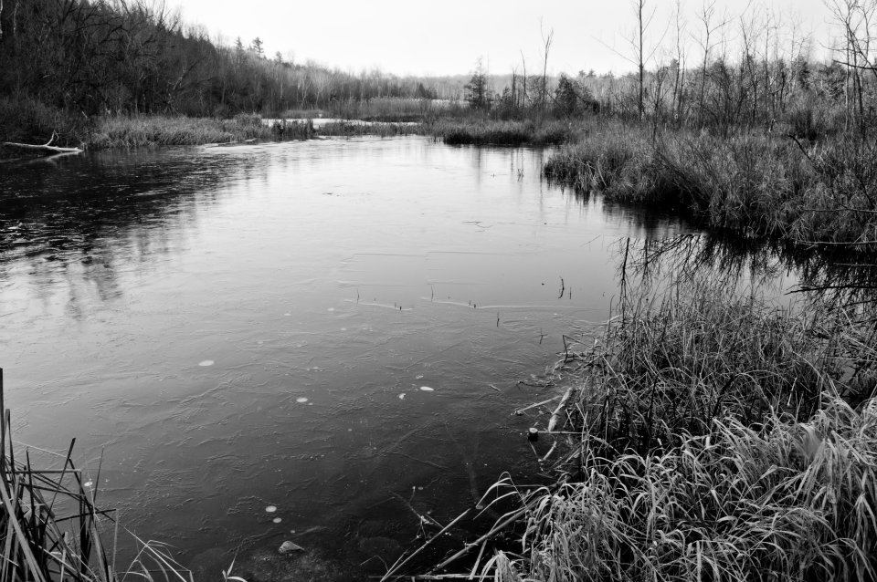
I just came back from 5 great days up at the family cottage – great days for family and down time, absolutely lousy for photography. Dull grey skies, bitter cold followed by rain but with no snow to “clean” things up. So today I went out to try and make up for it. I figured that after the cold night we’ve had, there might be some interesting ice up around the small limestone gorge around through which the

Eramosa River, Everton, Ontario
Eramosa River passes at Everton. There wasn’t, but here’s what I came up with over a period of 70 minutes or so.
The first photograph is of the general area I was working in. Dull green cedars, dull rock, dull sky, but dynamic water. So I de-emphasized the sky and composed and shot knowing I would be turning everything into black and white. What I found, as the afternoon progressed, was that my journey started with the obvious and gradually morphed into the abstract. The more time I spent looking, the more I began to see.
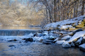
So here is the obvious – a small waterfall, but a wonderful dynamic created by the rushing river below the waterfall. I wanted to keep the birch on the right side as it provided a sense of depth so I knew I would need at least ƒ8, probably ƒ11. Also, due to the brightness of the “white” water, I would also need to increase my exposure to +1 stop above “normal” (using exposure compensation).

Eramosa River, Everton, Ontario
However, with these settings at ISO 100 my shutter speed was only 1/15th – too fast to really capture the swirling movement of the water. Adding an NDx8 and my polarizer slowed the shutter speed to 1 second at ƒ11 and, at ƒ16, 2 seconds. As it turned out, ƒ/11 was enough depth-of-field. The concern with ƒ16 and small sensors is that diffraction will reduce sharpness, so ƒ11 was used for most shots. However, a 2-second exposure produced the best water patterns, so I used ƒ16 knowing that stinger capture sharpening would be needed . One thing I’ve learned about moving water shots is that the patterns in the water are different with each exposure. I ended up exposing 8 frames before I had one with a pattern I was satisfied with. I photographed the same scene to produce a square composition – one that I am equally pleased with.
In Lightroom, I converted the raw file to B&W then used the basic controls to bring out the contrast between white water, dark water, white snow and dark rock. I ended up toning down the snow in the bottom right using a graduated mask and increased the brightness of the birch using a adjustment brush. Lastly, I worked with an adjustment brush at 50% flow to build up some of the exposure and contrast in the water flowing downstream.
This is a very pleasing image for me, given the dull day. Using increased contrast, I was able to extract from the flat lighting a three-dimensional dynamic image portraying the beauty hidden by the initial dullness.

Eramosa River, Everton, Ontario
With the “grand scene” finished, I began looking at some of the details. I worked on capturing that great flow of water. In this case, I kept the photo in colour and, in fact, increased the saturation significantly (100% – a first time for everything!). I found the increase in saturation gives the water and the flowing streams of white greater depth – a three dimensionality below the water that added to the three dimensionality across the water and from upstream to downstream. After a few ‘sketches”, I determined that a 2-second exposure gave the most dynamic water pattern, so set the aperture to ƒ14 accordingly. This is in combination with ISO 100, a polarizing filter, an NDx8 filter and +2 exposure compensation.

Eramosa River, Everton, Ontario
For about half the time I spent there, I worked on another small waterfall downstream of the original. In this case, I was looking down on it from above, and became intrigued with the interplay of water and ice, foreground and background. The water seemed to disappear into a nothingness. I had a terrible time with some cedars that kept creeping into the bottom of the frame and some snow that was on the rock in the upper right. This made composition critical. I could have cropped them out, but I would rather make full use of the sensor and spend a few extra minutes nailing down precise composition. Originally, I composed this a horizontal photograph due to the right left movement of the water. While it “works”, when I changed to vertical, everything seemed to fall together more precisely due to the natural shapes and lines in the image.
Again, a 2-second exposure gave the most dynamic water pattern, so I adjusted the aperture to ƒ8 along with the polarizer, NDx8 and an exposure compensation of +1.3 stops. In Lightroom, the raw file was converted to B&W and additional contrast was added to the water and the ice. Exposure was carefully controlled so as not to lose detail in the bright lower left. Finally, I added a split tone preset I created called “Subtle Sepia” which I find adds depth and life to the otherwise quite grey-looking scene.
Everton is a place I will return to throughout the winter. I must thank Alan Norsworthy’s Flickr page for introducing me to this photographic gem. There are many more wonderful images here awaiting just the right snow, ice and light.
For more on Winter Photography, sign up for one of my Winter Nature Workshops in Guelph on January 21st and in Dundas (near Hamilton) on January 28th. To learn more about Lightroom, attend the Introductory Lightroom workshop on February 18th followed by Advanced Lightroom on the 25th – both in Guelph. More information can be found on the Workshop page of my website: luxborealis.com
