A great way to learn and master Lightroom is here
Coming in April – the Lightroom Visual Guide: a screen-by-screen, module-by-module look at how to make best use of Lightroom.
Lightroom is the tool digital photographers have been waiting for and in version 3, it has matured to become essential for any photographer shooting more than a few hundred images per year. It brings together the power of non-destructive editing based on Adobe Camera Raw with an extensive and powerful database for keeping track of tens of thousands of raw, jpeg, psd and tiff files & videos. But LR is not as easy as dragging a few sliders – there’s a learning curve to customizing your workflow for high quality, repeatable results. The Lightroom Visual Guide will get you there!
In PDF format for use on-screen or printed out, the Lightroom Visual Guide provides panel-by-panel and palette-by-palette assistance to make active use of the many buttons, menus, and options available. Each of the five modules – Library, Develop, Slideshow Print, Web – has dedicated pages with explanations of each of the many palettes and panels. As well, there are pages for setting-up LR preferences, identity plates, renaming templates, exporting and more.
In the Lightroom Visual Guide you’ll find pages dedicated to:
- Preferences, Set-up & Customization
- Import View
- Library Module
- Develop Module, Palettes & Adjustment Tools
- Slideshow Module
- Print Module and Printer settings
- Web Module
- Export Options
- Black & White processing
Everything you need to be successful with Lightroom. And the best part of it is – until March 31st you can purchase the Lightroom Visual Guide PDF for the special pre-publication price of only $5.00.
Visit my website now to download a sample page and place your order. You will not find a simpler, more comprehensive way to finally master what has become the industry-standard for serious and professional digital photographers.
Mohawk College – Cutting Edge Learning
Last night I taught the first class of the new course in Lightroom being offered by Continuing Education at Mohawk College in Hamilton. I was pleasantly surprised to learn that with this course, we are on the cutting edge of learning.
Back in the Fall while teaching the Landscape course, a number of students asked about a course in Lightroom. I inquired about starting up a course only to learn that Mohawk does not have Lightroom on any of its computers and did not foresee installing it in the near future. I then suggested a BYO Laptop course wear students would download Lightroom for the educational price of $89 (US) directly from Adobe and show up to class with their laptop ready to go. And, voilá – here we are – the first course ever taught at Mohawk College Continuing Education using the BYO Laptop format.
When I was putting together the course proposal, I go thinking about how much more advantageous it is if people brought their own computer:
- no issues with an unfamiliar operating system between suers and what the college has; e.g. Windows and Mac or Windows 98 / Vista / Windows 7;
- familiarity with user customizations applied to the computer interface (icons, menus, dock preferences, etc.);
- students’ catalogues and photos would be with them, so no issues about loading catalogues;
- familiarity with the customization features of the Lightroom user interface.
Overall, it makes complete sense and with the cost and power of laptops being more of a non-issue, it has turned out to a near perfect fit. Now, if only the classrooms had enough power outlets for 18 users to plug-in! The problem was solved with a few power bars – thanks Anne!
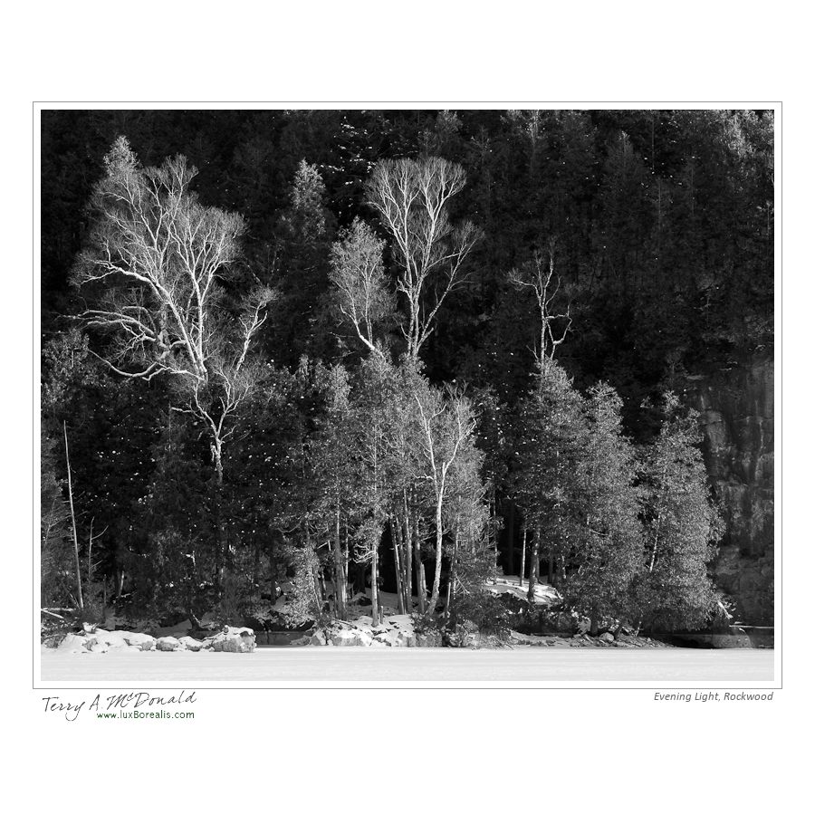
Rockwood, Ontario
Finally – I was out photographing in what has become increasingly beautiful winter weather. I spent a few hours at Rockwood Conservation Area, along the Eramosa River. Rockwood is quite spectacular with limestone cliffs and a spectacular assemblage of glacial potholes. On the downside, its beauty attracts a great many people which means many of the best snowy areas have been trod upon by people and their blasted dogs. I’ll need to get there first thing after the next snowfall.
Most important for me are the light and shadows, the shapes and textures. I was not disappointed.


Low Price of Aperture a huge draw
I can’t believe the price of Aperture – since the opening of the new Mac App store, the price has dropped to $79. What a deal and definitely worth the investment if you have a Mac more recent than my MacBook Pro of 2008.
My main complaint with Aperture was its slow response at times – a product of my MacBook more than anything else. In fact, recently, I’ve noticed a slow down and spinning ball with Lightroom at times, to the point where I’ve had to do a Force Quit. Lightroom seems to hang when inadvertently going to Web Module for All Photographs (totally over 20,000).
What I love about Aperture it is fantastic healing brush – far superior to the lame “Spot Removal” in Lightroom. It’s worth having it around just for that feature – but then there are the superb Apple books – unparalleled in the publishing world except at double the price.
New iPhoto Book hot off the press
Finally – I’ve finished the book illustrating our East Coast trip from the summer of 2010. An once again, Apple does not disappoint.

Cover of iPhoto book: East Coast 2010
The photos were processed in Photoshop Lightroom 3 then exported as high quality jpegs and imported into iPhoto ’11. From there, I dragged them into the project file and began creating, assembling and writing. I used the ‘Modern Lines’ theme for its clean look. I tried some of the less formal themes but found that I lost “photo space” to “page space”. I want the photos to dominate, not the page or the graphics.
The book ended up being 76 pages in length with 173 photos – the best of which are full page. The bulk of the text is set in 11pt DearJoe4 – a great handwriting font available as a free, incomplete font from dafont.com or as a full font from the creator at joebob.nl
I’m really pleased with how well everything came together. Only two complaints:
-

p75 with photos reversed compared to what I preferred
on one of the last pages, I wanted two small photos on the left with one large on the right to keep the somewhat chronological flow and iPhoto would only allow the larger pic on the right;
-

Cut off ascenders on p72
on 4-photo page, I wanted two full lines of text which I achieved by reducing the font size to 9pt, decreasing the leading to 0.83 but still, the very tops of the ascenders were cut off. BTW if you want a great resource for typography – have a look at Adobe’s online booklet; Typography Primer. It is very informative. It looks like a booklet Apple published about 20 years ago which they included with the Mac Classic.


These two complaints are a small price to pay for a great looking book. I could have remedied the second problem, but the first is an in-built design selection by Apple. And I can see why they keep the larger photo on the left of a right-hand page as the two smaller photos would be lost or squeezed if the larger photo was on the right.
Here are a few of the other pages:

The reproduction of the black and whites is superb on p9

This photo-on-photo of Dickson Falls on p21 worked very well

Composite of 2 photos created in Photoshop

One of my favourite photos is of our daughter Allison at the Habitation, Port Royal, Nova Scotia, dressed in period costume - it deserved a full page!
