Why are many online photos ‘dull’ and lacking in sparkle?

A quick and easy change will allow your photos to sing!
Funny you should ask, as it’s something I’ve noticed as well. YES, many photos appear dark/dim/dull and NO, it is not ‘artistic’ as some imply. In many cases, it’s simply a mistake by the editor, made innocently and without them realizing it.
Some argue that this a ‘new trend’? Nope! It’s poor craft, born out of not knowing the right way to set things up when editing.
The worst thing is when comments like this are made: “it’s up to you, there are no rules, except those that are made to be broken” as one commenter said.
My response: Please, do not perpetuate this ‘attitude’. Far too many students of photography (and I’ve seen my share over the decades!) use the, ‘I’ll do it my way’ arguement, or ‘That’s the way it was’ as a defence, when really it is down to poor craft.
Yes, there are rules. And, yes, they are made to be broken. But there is also good craft.
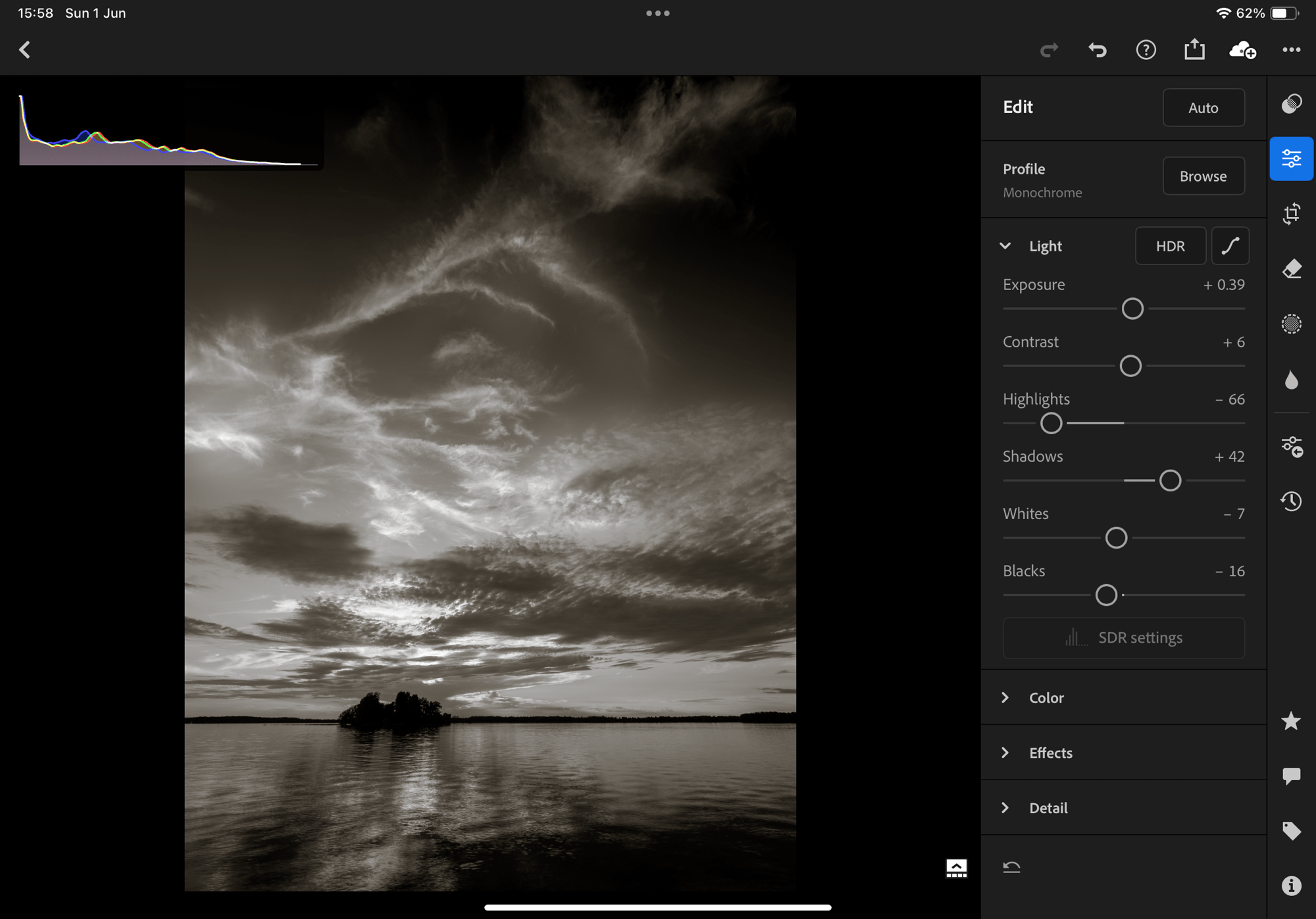
And good craft with full tone photos (which are most of the photos we see) is to have at least a few pixels of pure white. These few pixels allow the eye to correctly calibrate the tones in the rest of the photo.
Unconsciously, the first thing our eyes seek out in a photograph tends to be the brightest spot. This allows our brains to calibrate the rest of the tones. If there isn’t at least some pure white—especially when viewed against a white background like online, in photo books, and in prints—then our brains dim the whole photo.
It’s all done subconsciously, but we all do it. So the editor/printer needs to be aware of this tohelp the viewer with that calibration by having at least a few pixels of pure white. But how? Read on . . .
Additionally, highlights and shadows can be much livelier than are often shown in photos online. They are ‘dull’ due to poor set-up of the editing suite. When displayed on a white background, photos should be edited against a white canvas.
My theory (which it has been proven correct in countless workshop and class situations), is that many photos posted, particularly black-and-whites, lack highlights and have blocked up shadows because photographers are editing using the default BLACK canvas/background. This makes photos appear brighter during editing, but end up being dull against a white background.
Unfortunately, most editing suites default to black. ‘Dark mode’ is a trend, but it’s not helping photographers. Change the canvas (the area surrounding the photo when viewed in the editing suite) to white and you will see greater success in calibrating your photos (colour and B&W) for viewing on a white background.
The problem is our eyes are easily fooled.
Photos—both B&W and colour—should be edited against a WHITE canvas when they are to be displayed on a white background, as they are in most viewing situations: here online, in photo books, and as prints. BUT, many editing suites—Lightroom, PS, CaptureOne, etc.—default to ‘dark mode’ which is not the ideal. With Lightroom (on laptop, though not on iPad), and Affinity Photo, CaptureOne and Photoshop, the canvas can be changed to white and I urge photographers to do so. Simply right-click on the canvas just outside the photo and select ‘White’. Done.


The difference is subtle at best and, therefore, difficult to ‘prove’ except by observation, trial and error. Having seen it countless times, you’ll just have to take my word for it. Or, better yet, try it out yourself.
I’m from the wet darkroom era. Back then, good printing practice encouraged us to routinely curl the back of a print (pure white) next to the brightest white in the photo, just to ensure that the tones were bright enough without losing too much to pure white. This is just as important today with digital as it was back then. And having a white canvas helps.


I have contacted Adobe a number of times encouraging them to allow iPad users to set the canvas to white—and I’m not the only one! It’s just a a simple line of code that has been included for the laptop/desktop version, but for some reason they don’t see the need for iPad users, possibly because they are targeting Lr for iPad to people who may not realize the difference. Hello! There are plenty of us out there who know what they’re doing and are using an iPad for digital editing!!
Whenever I finish editing on my iPad, I export the photo to check it against a white background. Sure enough, 9 times out of 10, I need to brighten the photo before posting it to Facebook or Instagram or here—and I’m one who is aware of the problem! So, for those who are unaware, they end up publishing photos that are a bit on the dim or dull side.
So, keep this in mind when you are editing full tone photos—both colour and black-and-white. Check the histogram; export and check your photo against a white background. Or change your editing canvas to white—and pay attention to those few pure white pixels. It’s a subtle, but instant improvement.
Discover more from luxBorealis Blog
Subscribe to get the latest posts sent to your email.

Excellent investigation Terry. I have immediately change to a ‘light grey’ canvas in Elements…. with a view to white in the future. Will also pay more attention to the white end of the histogram, rather than avoiding it altogether.